Series 6: A New World!
1. Arabia
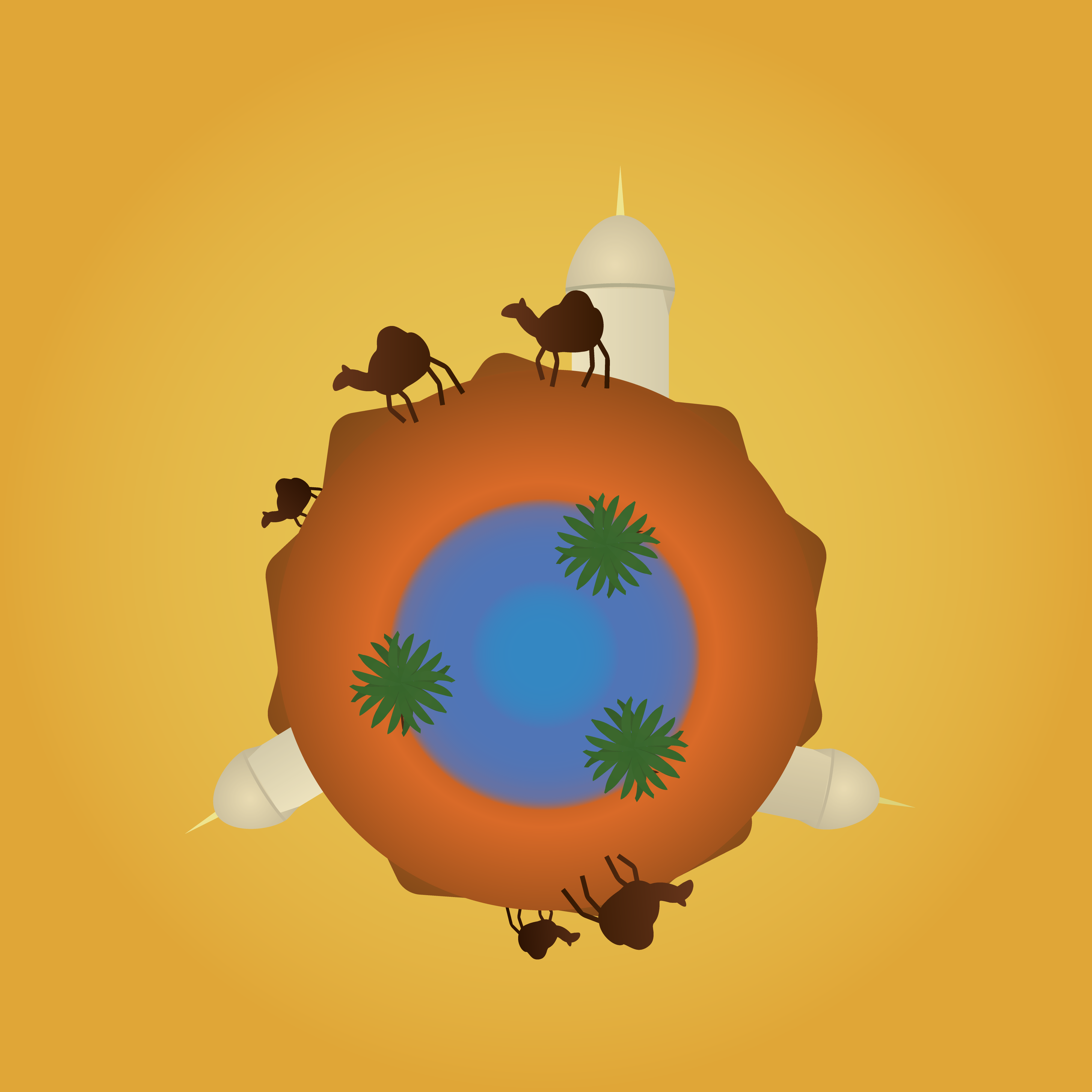
This was the first illustration I made after arriving in Spain, and the first one after a month-long break. It is pretty straightforward: an illustration inspired by Arabia.
2. Dirty Bomb Reimagined
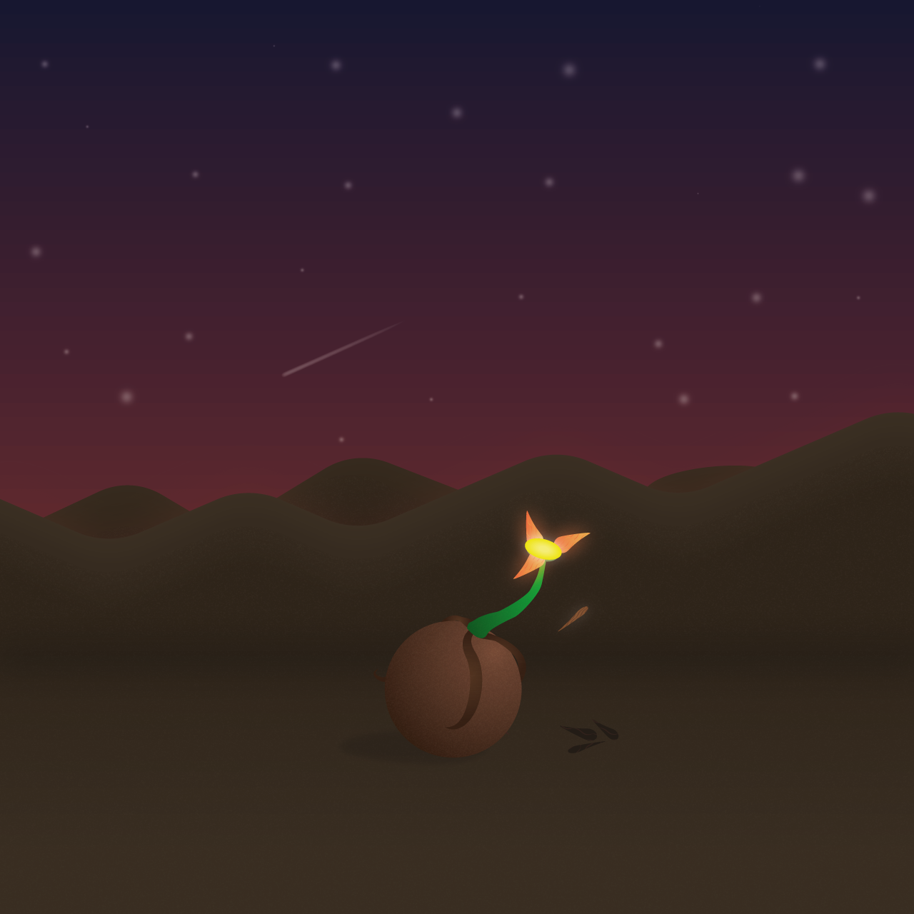
When looking back on my older work there was always one flat art that I felt could be done better: Dirty Bomb. I went with a space-like and empty landscape to contrast the dirty bomb itself: what will happen when all the petals have fallen and the bomb explodes?
3. Love Behind A Mask
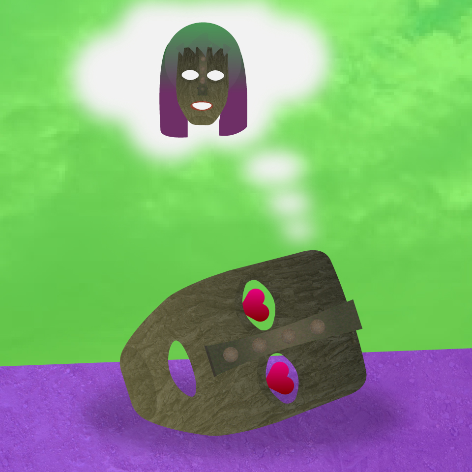
Thanks to this illustration I was able to let go of my previous design techniques. If I can make something this crazy work, then what else is possible?
4. The King of Vanity
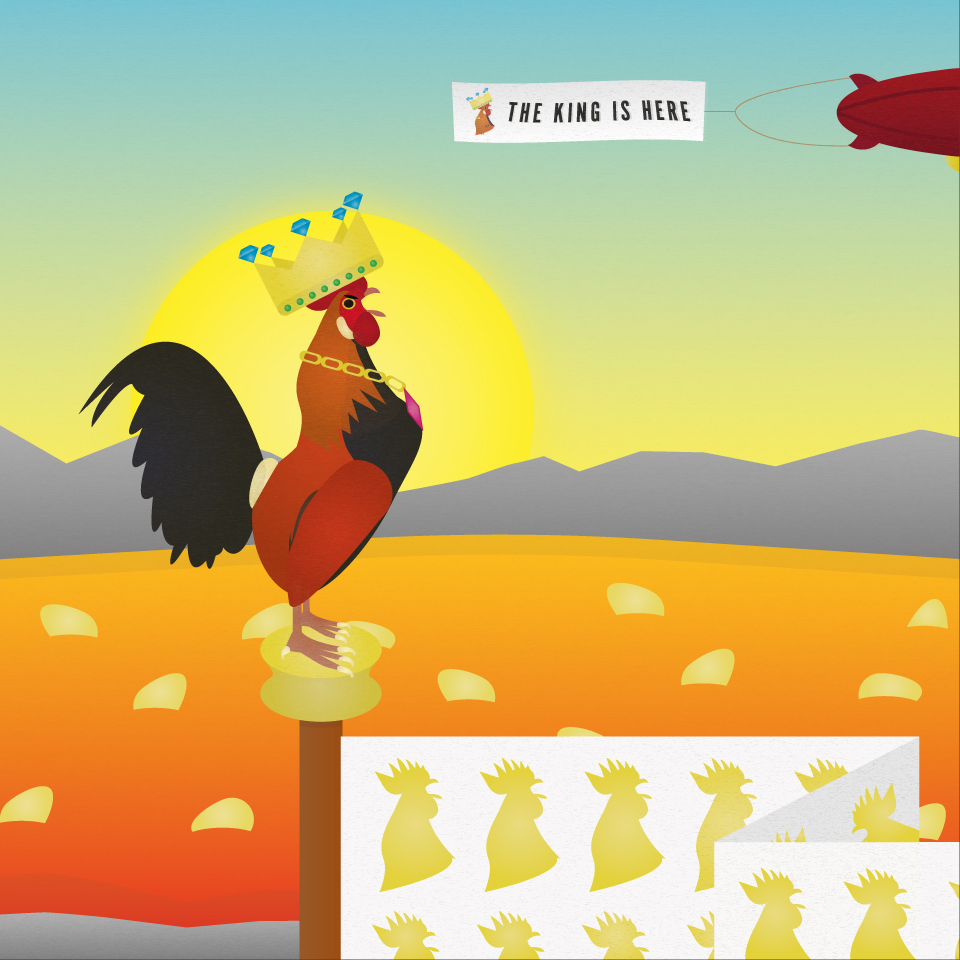
This illustration started as a joke towards my French friends in Valencia. This was one of the hardest illustrations to make, as the main character went through four very different backgrounds before finally settling on the volcano. The illustration visualizes pride, narcissism and ego.
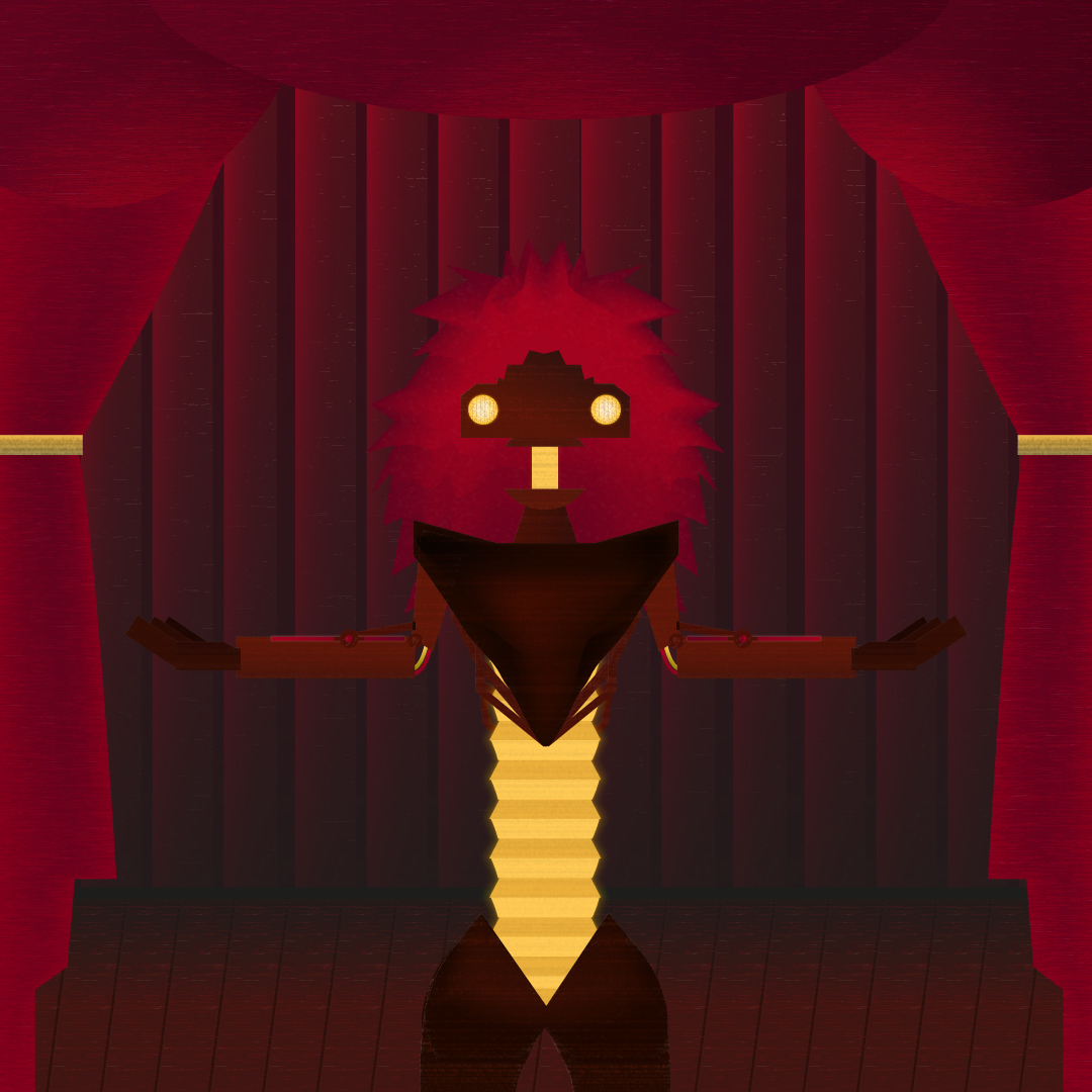
5. Showtime!
The creation of Showtime! was a real journey. I wanted to make a link with themes and styles that I was unfamiliar with, in this case steampunk. The robot's looks were not planned and came as I was building it. This is also one of my personal favorites because it is so different from what I used to make.
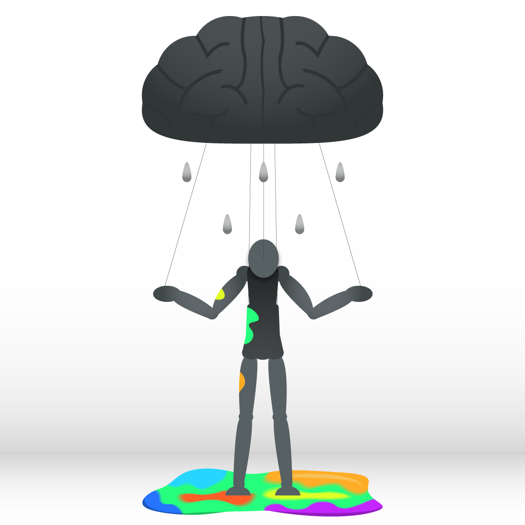
6. The Puppeteer
I always have at least one piece per series to express something that has been really bothering me. In the case of The Puppeteer it is overthinking. Because of this habit I was constantly stuck doing things that I already knew. No risks, no experiments. The Puppeteer is my answer to this trap.
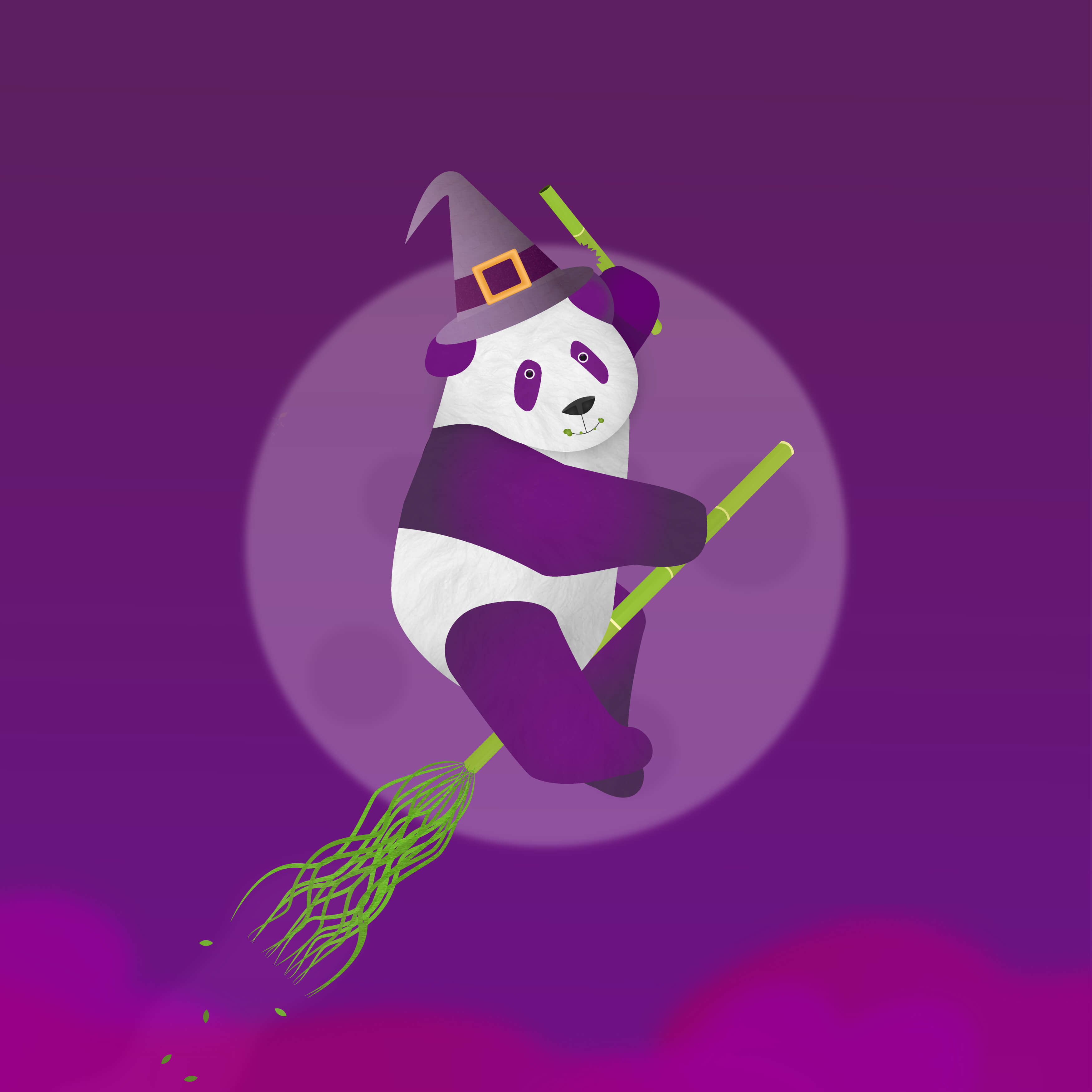
7. Bamboo Magic
Trying a new style doesn't always have to be in the workflow. What if the colors were completely different? Can orange, purple and green be combined into a visually appealing whole? I say yes.
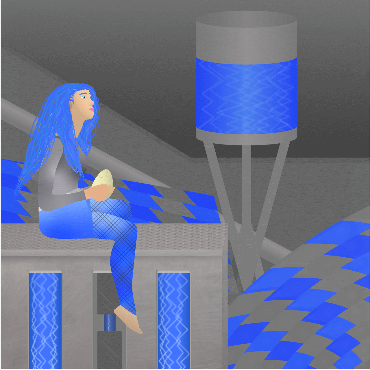
8. Chrome
Similarly to Showtime! I wanted to try a new style and theme in Chrome. Specifically, futuristic. Of this series Chrome took the longest to create because it takes a lot of time to make human bodies and backgrounds right.
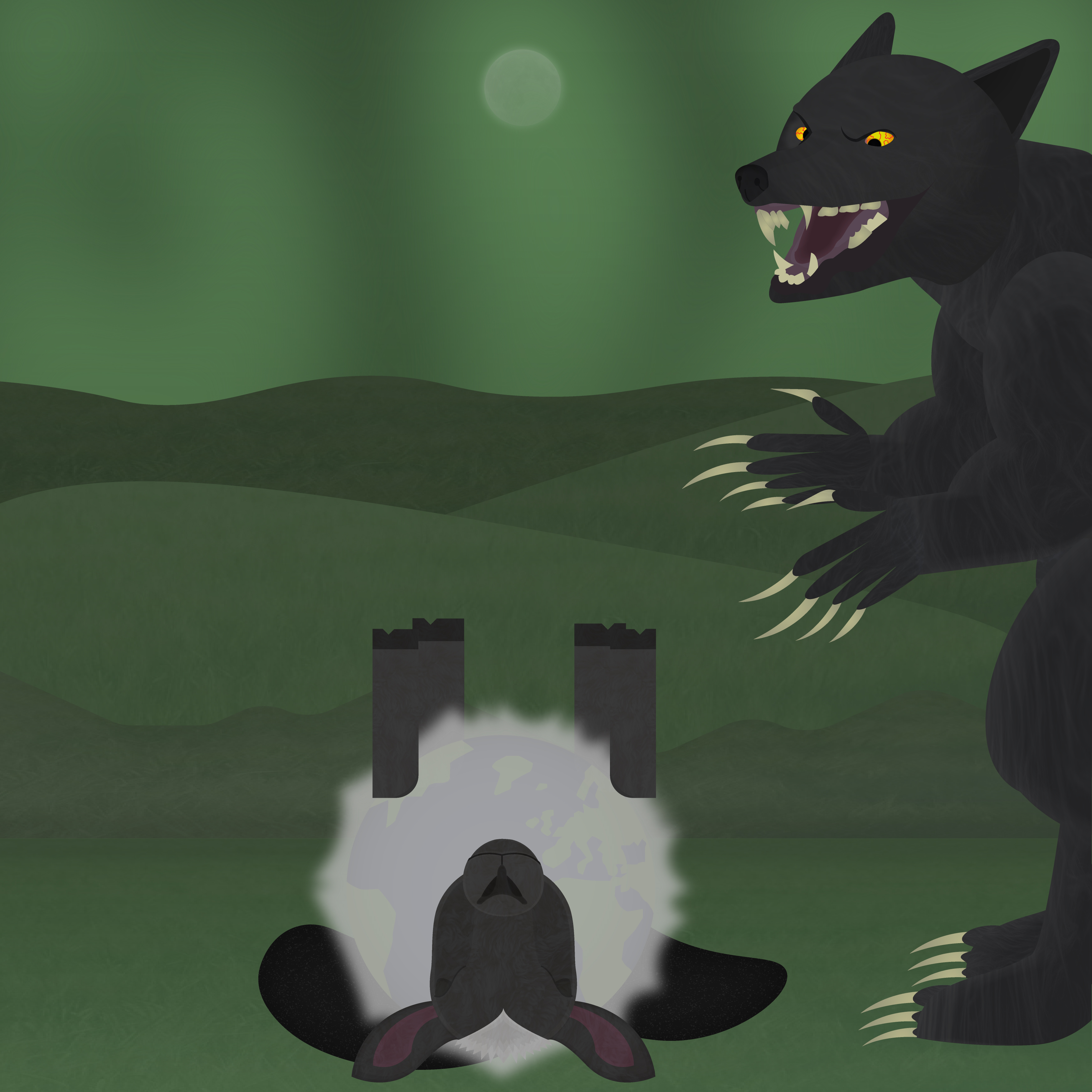
9. At Full Moon
This is the Halloween illustration of 2018. I always wanted to make a werewolf, so in this illustration I accepted the challenge and just went for it. Besides the obvious horror theme there is also a more subtle topic hidden in the wool of the sheep.
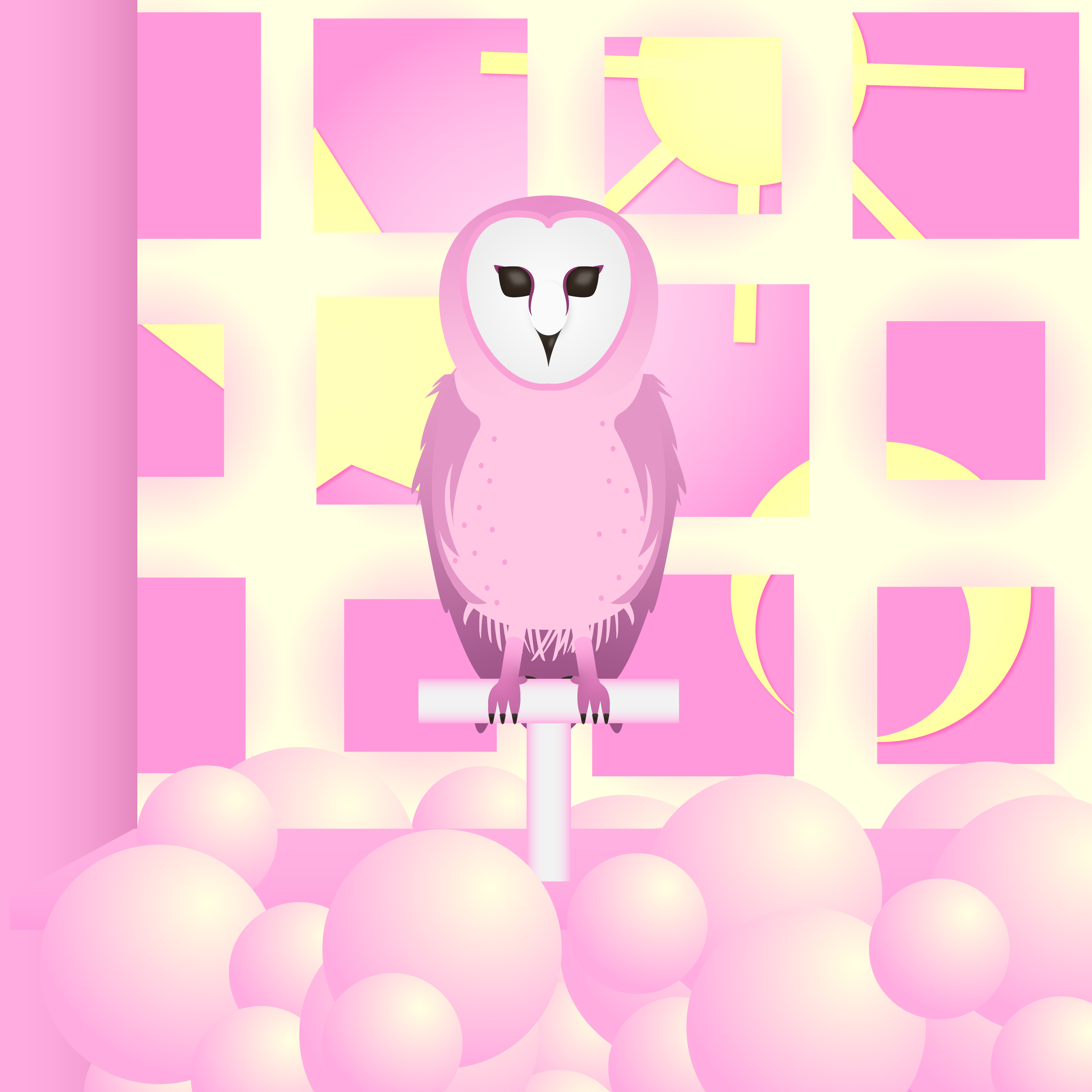
10. Jolly & Serene
It was important to me to be self-aware about what I make and why. In this piece I wanted to challenge my own preconceived notions of what I can make. So I went with the color I was least likely to choose and let myself loose with everything else.
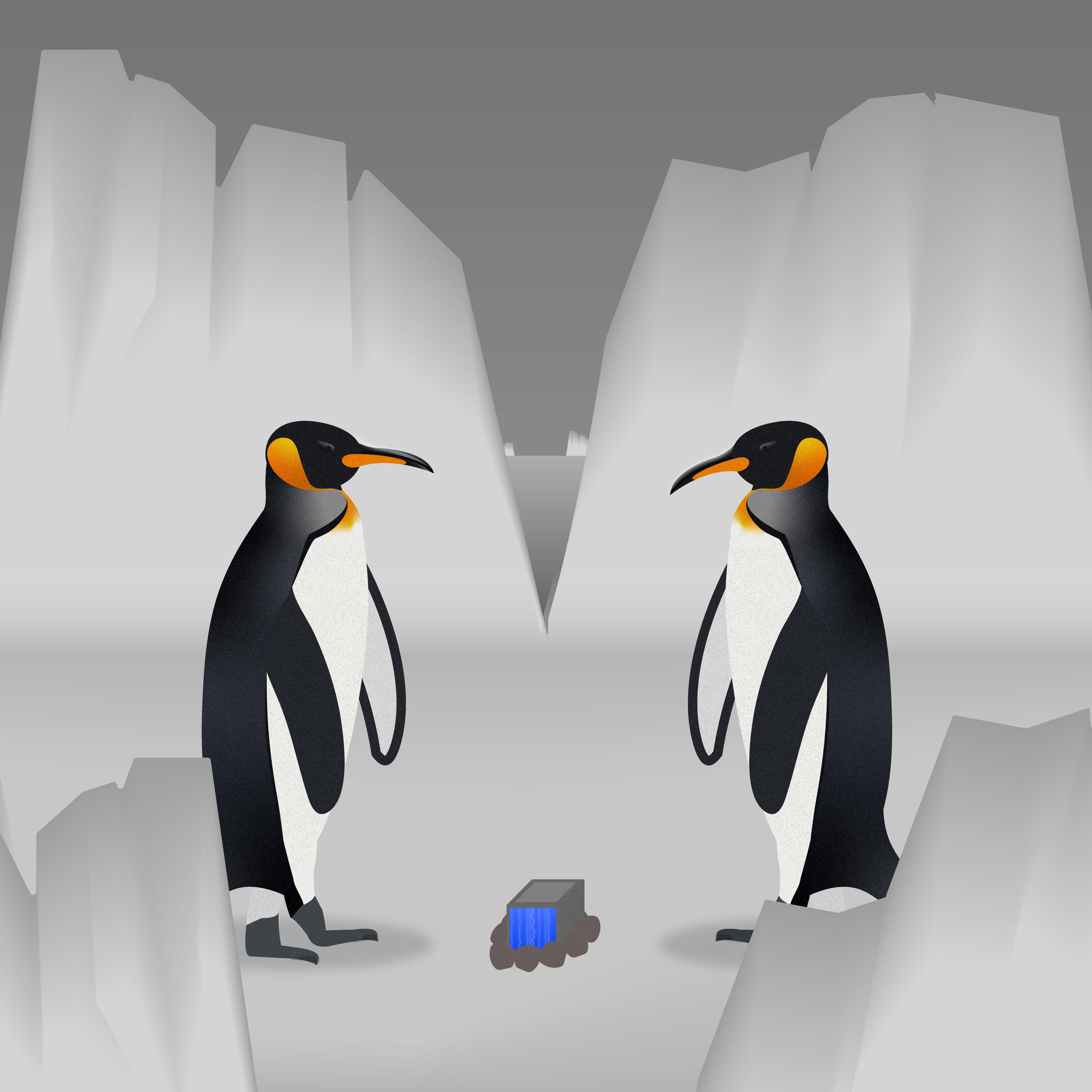
11. Switcheroo
This piece is partnered up with Chrome to create more links between the separate pieces. Switcheroo was actually created a few weeks after Chrome, so to have a callback/mystery to it is a fun way to find common ground between vastly different worlds.
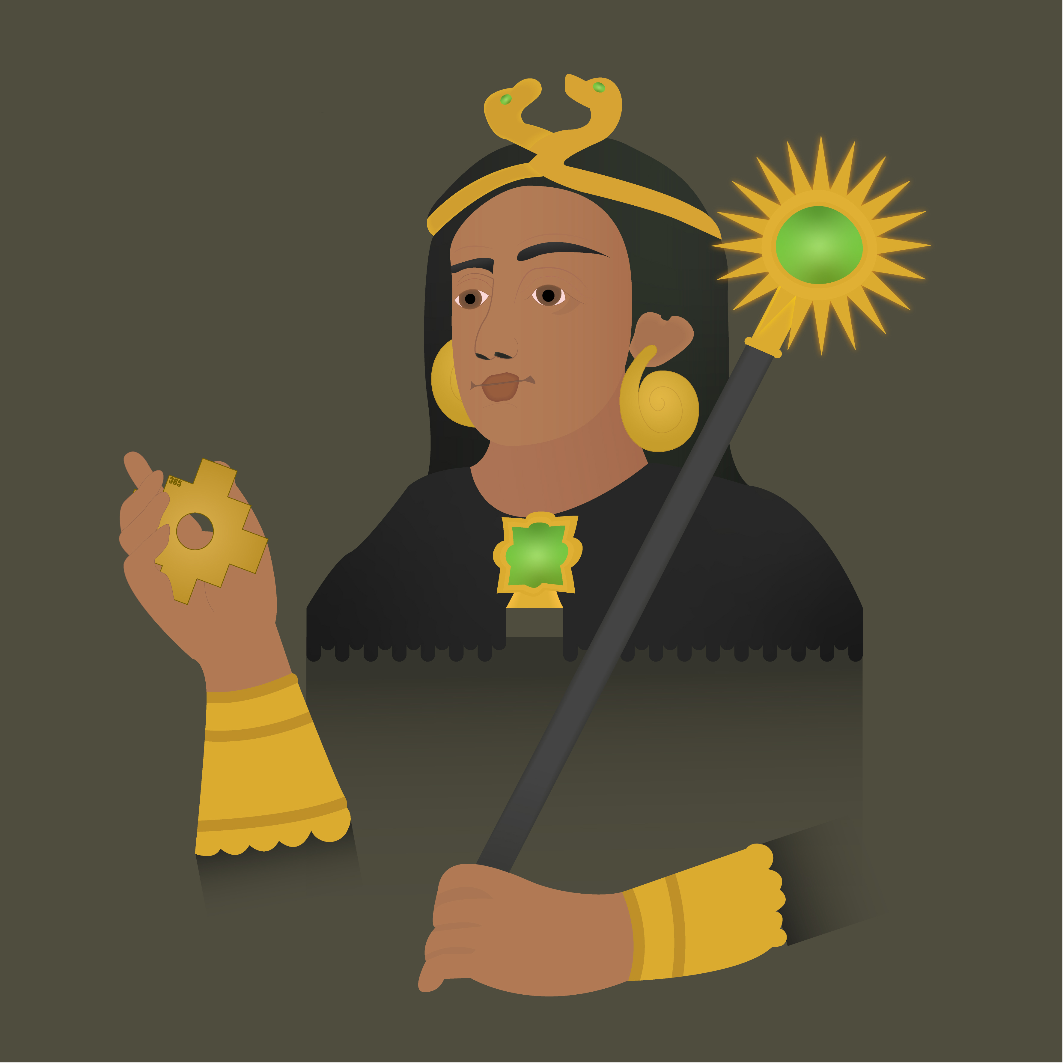
12. Atahualpa Reimagined
To end this series I wanted to give an older piece a fresh new look. I chose one of my favorites, Atahualpa. With more details and a touch of fantasy it was a nice way to celebrate my personal growth.